
In the age of pocket-sized screens and ever-evolving devices, websites can no longer afford to be digital monoliths, catering only to desktop giants. Enter responsive design – the chameleon of modern web development, seamlessly adapting to the diverse landscapes of the digital world. It’s no longer a trend but a crucial element for any website aiming to thrive in the multi-screen universe. Whether accessed on a phone, tablet, or desktop, the user experience remains flawless, content adjusts fluidly, and navigation stays intuitive. This isn’t just aesthetics; it’s a commitment to inclusivity, accessibility, and success. Understanding why responsive design deserves a central role in your web development strategy is vital.
Table of Contents
Embrace the Mobile Majority
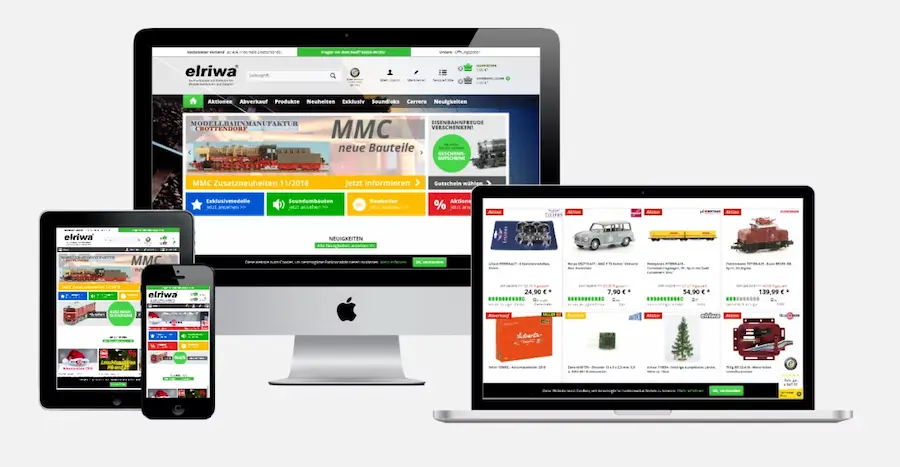
Smartphones have become digital extensions of ourselves, and ignoring their dominance is like building a castle on sand. Responsive design by a web development company ensures your website looks and functions impeccably on all screen sizes, catering to the ever-growing mobile audience. Imagine your website morphing effortlessly, instantly adapting to any device and keeping users engaged and satisfied.
SEO Adaptability
Search engines love responsive websites. Not only does it enhance user experience (a key ranking factor), but it also simplifies their job of indexing your content. With one URL for all devices, responsive design eliminates the need for separate mobile sites, making it easier for search engines to find and rank your website. Picture your website climbing the SEO ladder, reaching a wider audience, and boosting your online visibility.
Efficiency at its Finest
Say goodbye to the resource drain of managing separate desktop and mobile websites. Responsive design is a time-saving champion, requiring only one codebase to maintain and update. This translates to lower costs, quicker development times, and the ability to focus your resources on enhancing your content and functionality, not wrestling with multiple versions. Imagine streamlining your web development process, like saving time and resources for other business areas.
User Experience Reigns Supreme
A website that forces users to pinch, scroll, and squint is a recipe for frustration and abandonment. Responsive design by a web development company eliminates these pain points, delivering a consistent and positive experience across all devices. Users can navigate easily, access information readily, and engage with your website without technological roadblocks. Consider your website becoming a user-friendly haven, keeping visitors immersed and satisfied.
Future-Proofing Your Digital Oasis
Technology is a relentless tide, and websites built for the desktop-only era risk being swept away. Responsive design is your life raft, ensuring your website stays afloat and accessible regardless of future device innovations and screen size trends. Picture your website evolving gracefully, ready to weather any technological storm, and remain relevant for years.
Conclusion: A Universal Language for the Digital Age
Responsive design is not just a technical checkbox; it’s a philosophy for the modern web. It’s about inclusivity, accessibility, and catering to the diverse ways people interact with the digital world. By embracing responsive design, you’re not just building a website but crafting a universal language that speaks to everyone on every device at any time. Remember, in the multi-screen universe, adaptability is critical. Don’t be left behind – choose a responsive design, and watch your website become a digital haven that thrives in the ever-evolving landscape of the web.


0