
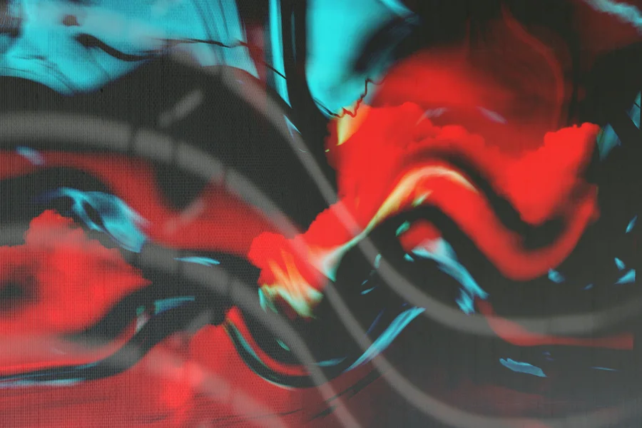
The currents album cover stands as one of the most recognizable pieces of modern music artwork. Visualizing Tame Impala’s third studio album, this striking image captures the themes of transition and personal growth through a unique mix of scientific diagrams and psychedelic design. The mastermind behind Tame Impala, Kevin Parker, collaborated with artist Robert Beatty to create an image that perfectly matches the album’s synth-heavy sound.
Table of Contents
What Is the Tame Impala Currents Album Cover?
The currents album cover is the official artwork for Tame Impala’s 2015 record, representing the themes of fluid motion and personal change. The design features a metallic sphere moving through parallel purple and black lines, leaving a turbulent wake behind it. From what we’ve seen in modern record shops, this cover stands out because it avoids the typical band photos or abstract shapes of most modern pop albums.
The music project Tame Impala is known for its detailed sonic layouts, and Kevin Parker wanted the cover art to reflect this precision. By choosing a design that mimics vintage textbook illustrations, the cover hints at the transition between order and chaos. The resulting artwork has become a cultural icon, frequently discussed by design students and music collectors alike.

Who Designed the Currents Album Cover?
American artist and illustrator Robert Beatty designed the Currents cover using digital vector tools and retro textures. Based in Lexington, Kentucky, Beatty has worked with several high-profile musical artists, creating a distinct aesthetic that feels vintage yet modern. According to a featured article in Pitchfork, Kevin Parker sent Beatty a diagram of vortex shedding, which sparked the entire design direction.
One detail most articles miss is how Beatty achieved the soft, airbrushed texture on the metallic ball. By combining modern vector illustration with digital filters that mimic old printing techniques, he made the image look like an old physics textbook illustration. In practice, this blend of digital precision and vintage styling creates the warm, nostalgic feel that matches Tame Impala’s music.
The Science of Turbulent Flow Visualized
The visual lines on the cover depict a real scientific phenomenon known as vortex shedding, which occurs in fluid dynamics. When a moving object, like the metal sphere, passes through a flowing liquid, it disrupts the straight lines and creates turbulent wakes. Robert Beatty art represents this physical process to symbolize how life events disrupt our personal flow, forcing us to adapt.
To understand the lines, think of water flowing around a bridge pillar in a river. The water bends, ripples, and forms small whirlpools on the other side of the pillar. The visual representation of this fluid dynamics process helps illustrate the album’s themes of change. Learning to read these visual diagrams is similar to understanding diagrams in physics class, a concept we cover in our guide on effective tips to study smart.
Design Style and Color Palette
The Currents cover uses a vintage sci-fi aesthetic inspired by 1970s paperback covers and science textbooks. The background consists of straight, horizontal purple and black lines that represent a calm, steady state. As the metal sphere enters the frame, these lines bend and warp into vibrant red and silver waves, signaling disruption and transformation.
We’ve noticed that this color contrast is highly effective for catching a buyer’s attention on vinyl shelves. A common myth is that album artwork must feature the artist’s face to sell copies. The reality is that the Currents design tells a complete story through lines and colors alone, which is a key principle in creating a successful visual story and narrative. By keeping the design focused on abstract ideas, Beatty created a cover that remains memorable years after its release.

How Did the Currents Cover Influence Graphic Design?
Since the release of the album in 2015, the Currents cover has inspired a wave of retro-futuristic designs in poster art and advertising. Many designers began copying the airbrushed textures, heavy gradients, and physics-inspired themes in their own projects. Beatty’s portfolio, which you can view on Robert Beatty’s official portfolio website, showcases how this style has evolved across different mediums.
We prefer hand-drawn and analog-style digital art over clean, corporate vector graphics because it carries more character. However, one common pitfall when recreating this style is using too many bright gradients at once. This usually leads to a messy design that hurts the eyes; keeping a limited color palette like the purple, red, and silver used on Currents is a better alternative.
Frequently Asked Questions
What is the meaning of the Currents album cover?
The Currents album cover represents the theme of personal transformation and change. The metallic sphere traveling through flowing lines symbolizes an individual moving through life, disrupting their environment and creating new paths.
Who designed the Tame Impala Currents cover?
The cover was designed by Lexington-based artist and designer Robert Beatty. He collaborated closely with Tame Impala’s frontman, Kevin Parker, who provided the initial scientific concept for the artwork.
What scientific concept is shown on the Currents cover?
The cover shows vortex shedding, a concept from fluid dynamics. This occurs when a fluid flows past a object, creating an oscillating pattern of turbulent ripples behind it.
What programs did Robert Beatty use for the Currents cover?
Robert Beatty used vector design software like Adobe Illustrator to draw the clean lines, and then applied digital filters and custom textures to create the classic airbrushed appearance.
Is the Currents album cover real or digital?
The Currents cover is a digital illustration designed to look like a vintage, physical print. Beatty used specific digital tools to mimic the look of mid-century textbooks and sci-fi books.
Why did Tame Impala use a physics diagram for the cover?
Tame Impala frontman Kevin Parker has a strong interest in science and felt that a diagram of turbulent flow perfectly captured the feeling of his new synth-pop music, which focuses on transition.

Written by Rosella
Rosella is a self-taught digital creator with a passion for breaking down tech, lifestyle, and everyday topics into simple, easy-to-understand content. Based in Youngstown, Ohio, she brings a curious, multi-disciplinary approach to writing, covering everything from the latest tech trends to practical life hacks and personal growth insights.
Her goal is straightforward: take complicated ideas and explain them in a way that actually makes sense, so every reader, whether a total beginner or someone more experienced, walks away having learned something useful. When she’s not writing, you’ll usually find her exploring new tools, sharpening her skills, or spending time with family.
Through this blog, Rosella aims to build a community centered on real, actionable insights rather than fluff, jargon, or filler content.

0